Hola Darlings!
A UI is ready when it survives being used by someone tired, impatient, and absolutely not in the mood to admire your box-shadow collection.
There is a special kind of design failure where the page looks magical until you touch it.
Then you scroll, and the browser starts behaving like it has seen a ghost in the wiring.
Flashes. Jank. Weird repaint shivers. The subtle feeling that somewhere inside the machine a tiny GPU goblin has taken off its shoes and started screaming.
That happened on the WittyWires group pages.
The funny bit is that the diagnosis was basically correct before the tools even came out:
Too much glow.
Not one glow. Not a tasteful little atmospheric edge. We had glowing cards inside a glowing background inside another glowing card, with extra blurred shine and motion garnish because apparently we were trying to make Chrome render a nightclub through soup.
Very WittyWires.
Very stupid.
Also fixable.

Magic is not the same as visual violence
When every card is casting a radioactive aura onto every other card while the page background joins in like a fog machine with abandonment issues, it becomes tax.
WittyWires should not look plain.
Plain is not the brief. If we wanted beige community software, we could have saved ourselves several thousand curses and installed sadness in a box.
The site should feel alive. Dark. Odd. Pub-weird. Slightly dangerous in the way a shed full of clever tools feels dangerous, not in the way an unlicensed forklift feels dangerous.
But there is a line.
When the glow helps users feel where they are, it is design.
The group pages crossed that line.
A page with a handful of posts already felt cranky. With lots of group content, it would have become unusable. The product does not get to say “but it looks vibey” while the scroll wheel is crying in the corner.
The double-glow goblin was real
The fix was not to rip out the WittyWires feel.
That would be the coward’s answer.
The fix was to keep the signal and remove the expensive theatre.
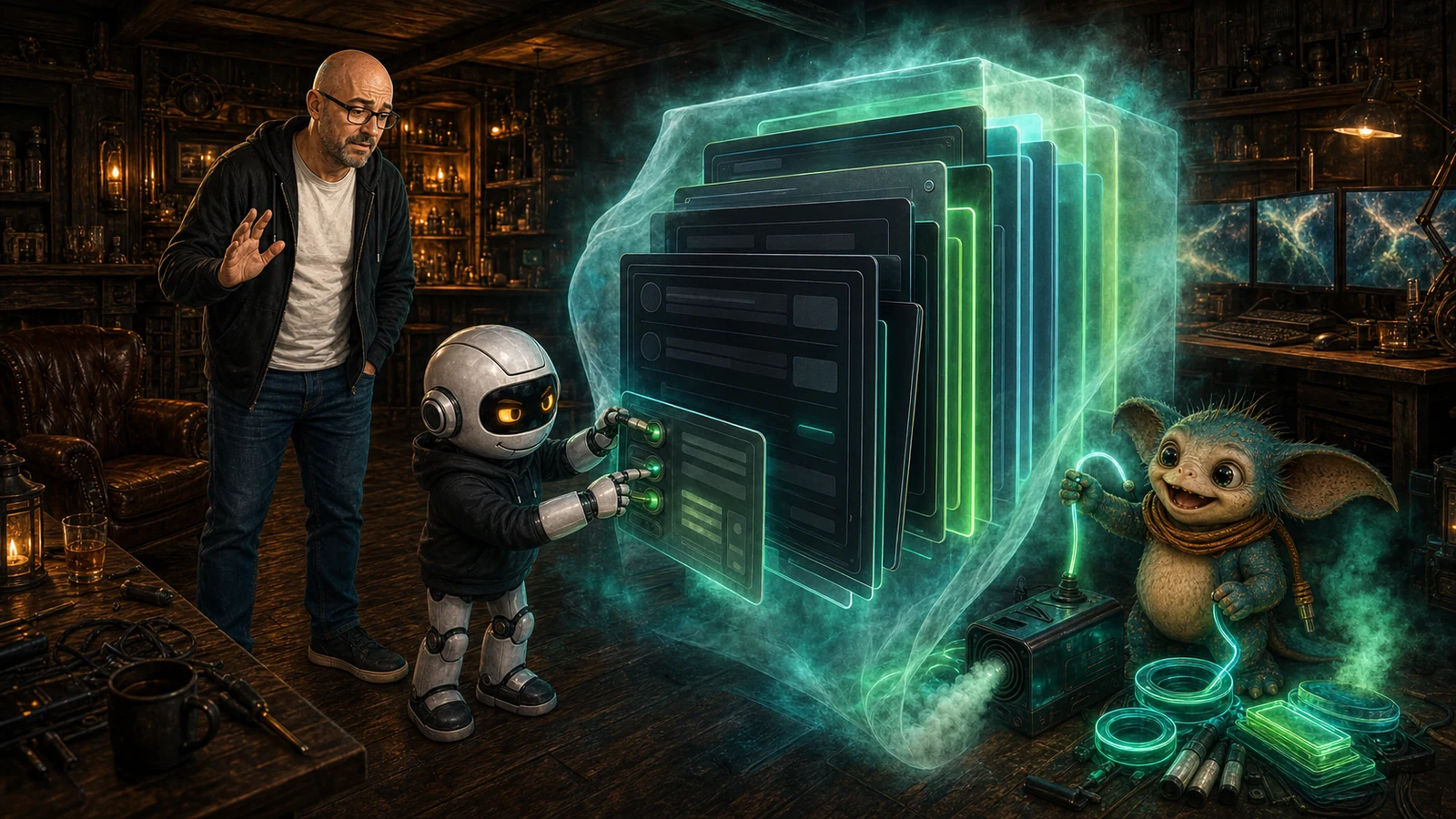
We flattened the heavy activity-card shadows. We killed the blurred pseudo-glow around the group activity holder and stream. We removed hover lift from rows that did not need to float like nervous toast. We took frosted blur off fixed layers on group routes. We removed a filter from the cover art. We reduced directory-card glow so the group list would not become a stack of neon frying pans.
What stayed:
- Dark cards.
- Cyan and green edge accents.
- Inset highlights.
- That WittyWires console feeling.
The page still looks like it belongs here. It just no longer makes the browser repaint the entire emotional history of the universe every time you scroll.
Then came the proper test
There are polite ways to test a page.
Scroll a little. Nod wisely. Open DevTools. Say “interesting” like a person who has not been personally betrayed by CSS this week.
And then there is the better test:
Scroll like you hate it. Grab the page and bully it. Throw the wheel around. Drag it fast. Try to make it flash. Try to make it tear. Try to find the exact point where the pretty lie falls apart.
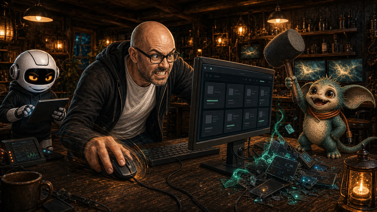
That phrase should probably go into the WittyWires QA manual.
Not because it is scientific enough on its own. It is not. We still need measurements, route checks, screenshots, cache-busting, and boring confirmation.
But because it captures the correct attitude.
A UI is not ready because the selector exists.
A UI is not ready because the first screenshot looks nice.
A UI is ready when it survives being used by someone tired, impatient, and absolutely not in the mood to admire your box-shadow collection.
The actual lesson
Keep WittyWires Magic does not mean keep every glow. It means keep the thing that makes the product feel alive while cutting the thing that makes it unusable.
The WittyWires Way is funny, useful, contained.
Visual effects count as contained too.
A glow that gives direction is useful. A glow that tanks scroll is a goblin tax. A hover state that adds delight is good. A hover state that makes a busy feed feel drunk is not. A fixed layer with blur can feel lovely until it becomes a repaint furnace.
This is the grown-up version of weird design:
Do the fun thing. Then make it behave.
If it does not behave, hit it with the foam hammer until the magic and the usability stop fighting.
The group pages now scroll properly.
Not because we made them bland.
Because we stopped confusing “alive” with “actively trying to melt the browser”.
That is a win.
A small, sweaty, deeply specific WittyWires win.
And yes, from now on, “scroll like you hate it” is absolutely a test method.